Demo Image

Lorem ipsum dolor sit amet, consectetuer adipiscing elit. Aenean commodo ligula eget dolor. Aenean massa. Cum sociis natoque penatibus et magnis dis parturient montes, nascetur ridiculus mus.

Donec quam felis, ultricies nec, pellentesque eu, pretium quis, sem. Nulla consequat massa quis enim. Donec pede justo, fringilla vel, aliquet nec, vulputate eget, arcu. In enim justo, rhoncus ut, imperdiet a, venenatis vitae, justo. Nullam dictum felis eu pede mollis pretium.


In a nutshell

The Schwartauer Werke Company tapped into a new market in Germany when it started producing CORNY cereal bars in 1984. At the time, no comparable product existed in Germany or anywhere else in Europe for that matter. CORNY quickly gained in popularity and has become the best-known cereal bar in Germany and Europe – in fact, CORNY has become synonymous with cereal bars in general. In addition to the successful classic bars, varieties like CORNY free, CORNY BIG, CORNY Milch (Milk) and CORNY nussvoll (nutty) create a broad and diverse product range.

The challenge

For their summer limited edition they created the flavors "white chocolate" and "white chocolate with coconut". To increase their sales figures Corny started a cooperation with Tui and the chance to win 10,000 € if you buy one of the two flavors. My task was it to create the back panel design of the two products. 

  • back panel design needs to be in line with their new developed CI
  • create a stopper that fits in the created summer mood but gives enough room for all the information about the competition

In a nutshell

One man, one mission: In 1903 Walter Rau established the Teotoburger margarine factory Walter Rau in Hilter closed to the Teutoburger forest, Germany. Since their first day, they produce everything with a love of nature, passion and sense of responsibility. Over 50 years they're selling their products under the name "Deli reform". The brand is known for its carefully chosen ingredients which lead to an unique taste. In addition to the successful magarine, products like vegetable based cream (used for cooking), herbs spread, oils and lard create a broad and diverse product range.

The challenge

For their new product range "Gemüse aufs Brot", which translates into "vegetables on your bread", the company gave Roman Klis Design the task to create their packaging design. Their product can be bought in 4 flavors: tomato, pepper, mushroom and olive. 

My task was to fine-tune the chosen route with following items:

  • change the current appetite appeal into natural, delicious and less artificial vegetables. Also arrange those in an appetizing way around the created logo. Leaves may be used if it helps to recognize the vegetable. 
  • create a stopper including the information: flavor, percentage and the wording "and other vegetables"
  • place the list of ingredients into the field provided on the back panel.


In a nutshell

ACC Akut® is one of many OTC-brands of Hexal, which is one of Germany's leading generic drug companies since 1986. With their wide range of highly efficient products it is part of families everyday life during flu season. The ACC Akut® product range includes expectorant as effervescent tablets in different active substances and cough syrup for adults as well as children.

The challenge

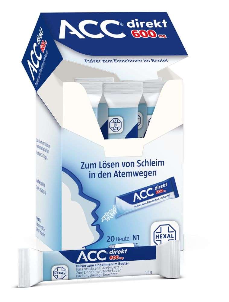
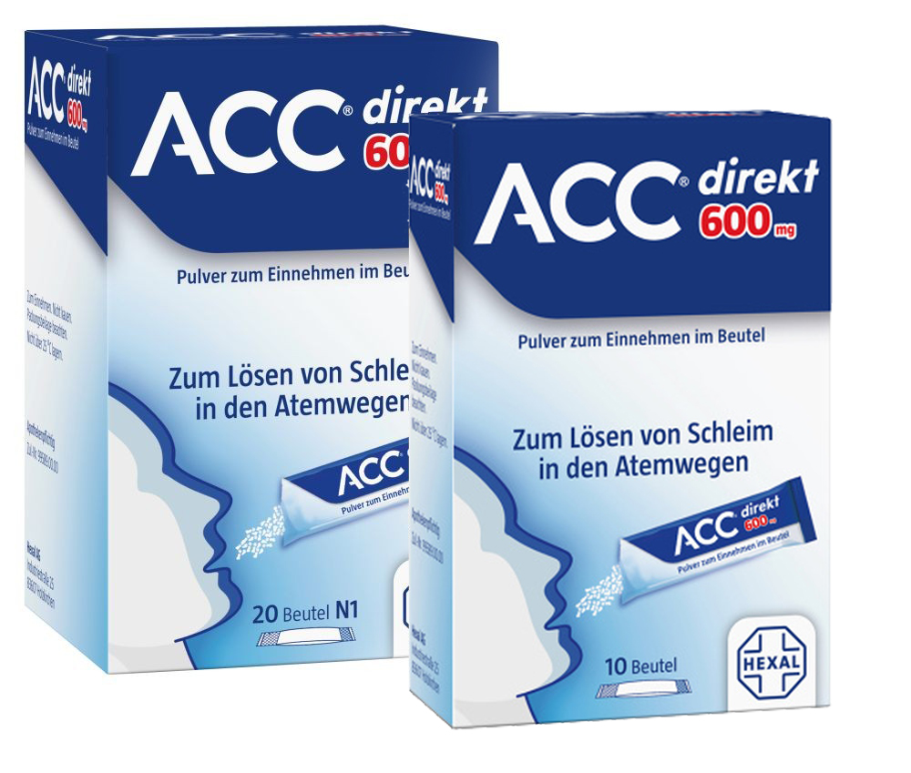
For their newly developed product an expectorant powder for oral use called ACC direkt® they needed a design for the packaging of the 10 sachet and 20 sachet box. My task was to design the front-, back- and side panel as well as the sachet with following informations:

  • create the front panel design with following elements: logo-element, a face which shows the taking of the product (style of the face tbd), hexal logo and number of sachet
  • wording on the front panel: "sachets of oral use powder" and "loosens mucus in the airways"
  • create a color gradient from blue to white as used in the ACC Akut® range
  • create a realistic look of the sachet on the front panel
  • as soon as the front panel is approved adapt the design to side- and back panel

The illustrated face fits well into the style of the ACC Akut® range. The hard color gradient from dark blue to white shows the effect of the product perfectly.


Due to the fact that I'm committed to maintain confidentiality about all the products I designed for Roman Klis Design which are not on the market yet I can only give you a list of cients and the specific products I've been working on.


  • Extra 600g (appetite appeal retouching)
  • Gelee (AA retouching)
  • Samt (appetite appeal retouching)
  • Samt winter edition (design layout and digital artwork)
  • Extra winter edition (design layout and digital artwork)
  • Samt winter edition ad (design layout and digital artwork)


  • "Haferkraft" POS (design layout and texting)
  • CI manual 
  • "Streets of Berlin" (cereal bar retouching) 
  • design of two product launches


  • Freschetta redesign on front and back panel (digital artwork)
  • Red Baron redesign on fron and back panel (digital artwork)
  • logo redesign for both brands


  • Früchte Traum (AA shooting and retouching)
  • Obstgarten design of two product launches
  • Frische Cremequark redesign
  • Almighurt design of two product launches
  • Grand Dessert design of two product launches
  • Monsterbacke redesign


  • appetite appeal shooting and retouching
  • logo redesign
  • packaging design layout


  • logo redesign
  • packaging redesign (scribbles to digital artwork, client rebriefings and final artwork)
  • illustrative drawings of the product range


  • creative session, scribbles and first digital artwork of the lid
  • my design route got chosen
  • realizing the clients rebriefings 
  • adapting the design on pot and tray 
  • final artwork of lid, pot and tray


  • funny mix (Asia) adjustments on illustrations
  • jelly chocs (Turkey) adjustments on illustrations
  • Grapes (China) adjustments on font, color, bear and illustrations


  • essence design of a product launch and relaunch
  • Catrice cosmetic design of a product launch and relaunch
  • workshop preparation for both brands


  • KitKat and KitKat Mini Moments (Middle East) creative session and tray design
  • Maggi "Herby Bouillon" and Maggi "Totole - chicken bouillon" (Middle East) front and back panel design
  • Herta Finesse (Germany) front panel design
  • Buitoni (Europe) front and back panel design changes
  • Nescafé 3in1 sachet 3D design


  • logo redesign with current font but new illustration/ my logo got chosen
  • packaging redesign (scribbles to digital artwork and client rebriefings)


  • redesign of their whole cheese range (cheese spread, Original, mild, shredded cheese) in Middle East 


  • scribbles as photo-brief for their christmas calendar 2018 

  • redesign on front panel (digital artwork)


More Articles ...