In a nutshell
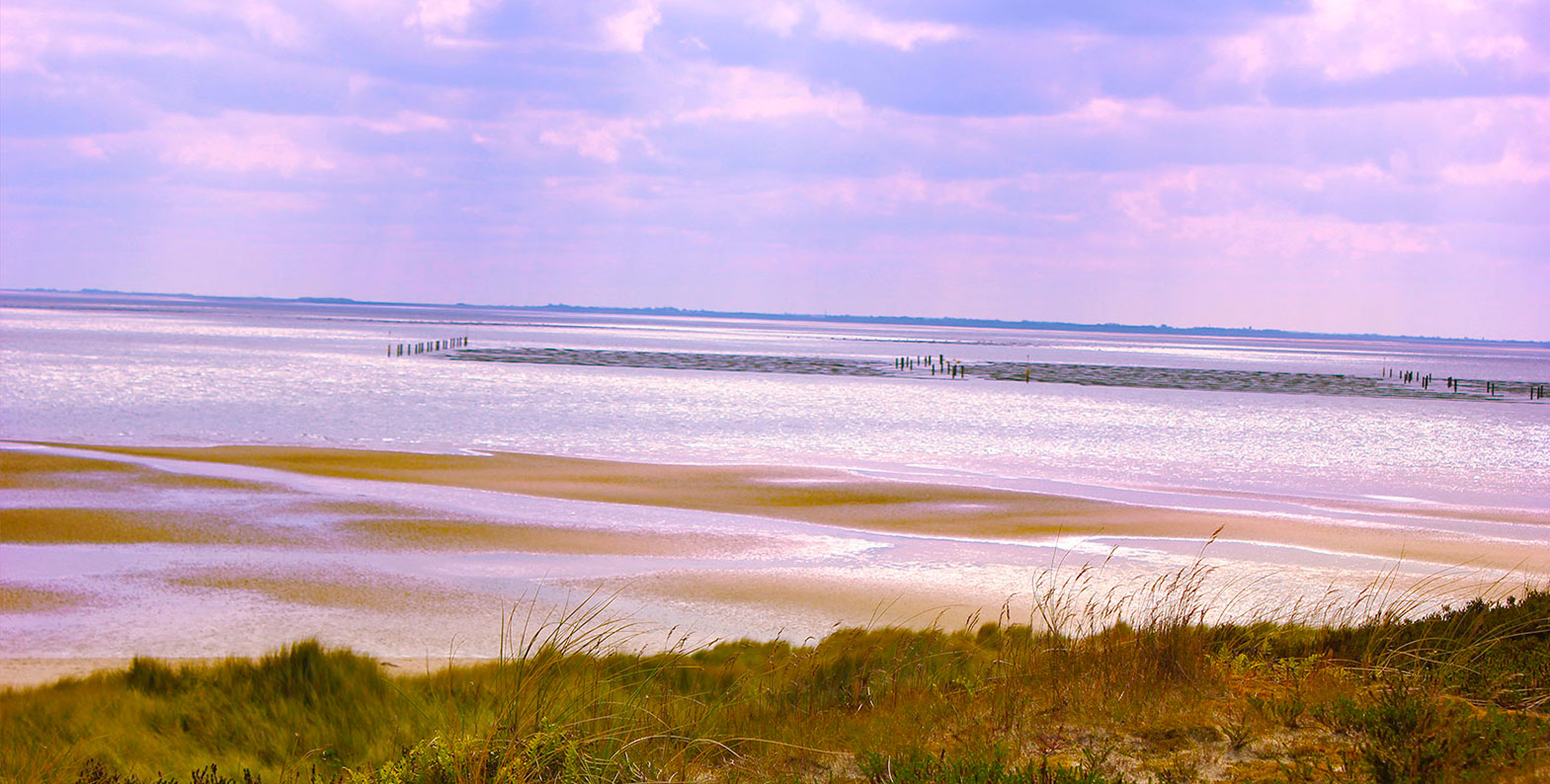
The area between Den Helder, the Netherlands and Esbjerg, Denmark is the biggest contiguous area of mudflats in the world and one of the last areas in Europe in which nature is left to take its course - free of human influence, to the greatest possible extent. To keep it that way the German coastal states established the national park: In 1985 the area of Schleswig-Holstein, 1986 Lower Saxony and Hamburg followed in 1990. Since 2009 it is part of the World Heritage Site, resulting in many successes fighting for the survival of different species.
The Challenge
As amazing and important as their work is, the Germans seem to forget this place even exists. The time was ripe to redesign the Corporate Design of the national park and get the attention they deserve. With a main focus on their work, protecting animals and giving as much informations as possible, always in consideration of their target group.
What I did
After analyzing their current Corporate Design it became evident that most importantly the national park needs a consistent look and feel through all three states, starting with only one logo replacing the five currently existing.
 |
|
Logo
After some research I discovered that without the foundation of the national park and its related hunting bans, the gray seal would have been exterminated by now. But thanks to the national park the stocks are recovering. So what could be a better symbol for the national park than their greatest success?
![]()
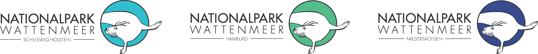
The outline of the gray seal I illustrated is not evenly so it creates a look and feel which perfectly symbolize the tides. The national park is always changing and most of the animals living there come and go with the seasons, but the national park gives them a shelter to rest, hatch and feed in peace. Every state gets its unique color, which are relative to their habitat; Hamburg for example, has a bigger part of salt marsh than Lower Saxony.
Target group
- families
- senior citizens
- short vacationers
which are all nature lovers
Advertising
After talking to employees of the national park I found out that they don't advertise that much since they aren't looking for mass tourism but only for those tourists who are already interested in nature or want to learn more about it. This is a really important fact to consider when designing the advertisement. So I've decided to create a headline that catches attention and speaks to pretty much everyone who is interested in traveling. The copy not only gives more information about the shown animal but also reveals only to the target group of the national park.


Website
before


after


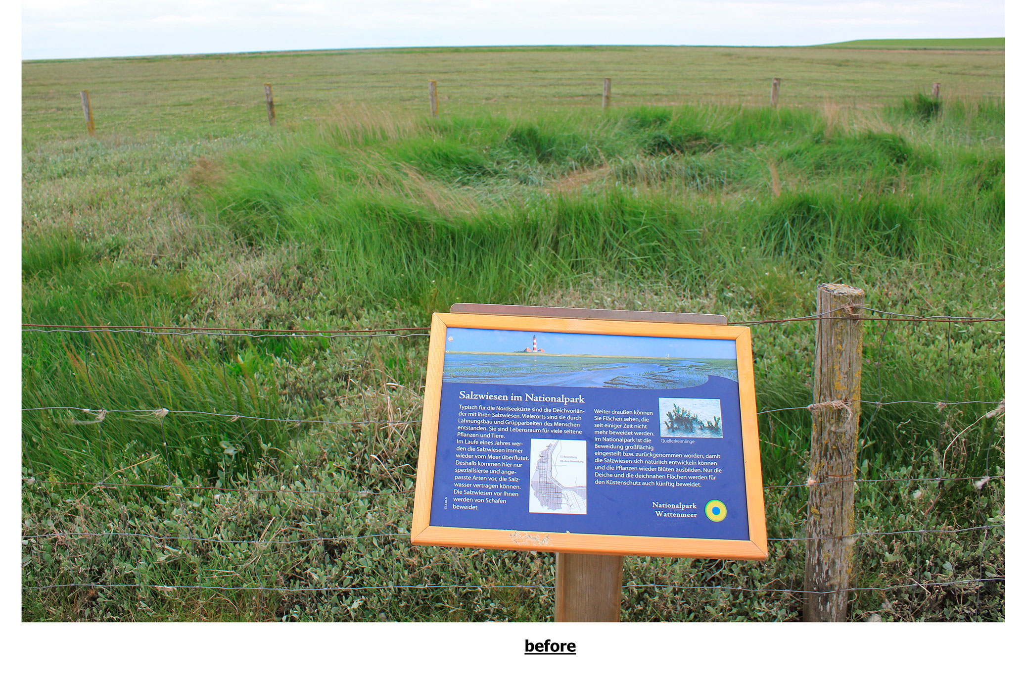
Info sign


Info flyer


App
|
before Since every tour provider has their own flyer without an uniform design, the visitors are getting overwhelmed with informations and dates because every flyer shows a one-year-plan of the events.
|
|
after To solve the information chaos I decided to design an app which offers all the relevant informations like events, tides, hiking maps, weather etc. But the most important feature is to give the visitors the opportunity to type in their vacation time period. This way they get just the events happening during their stay instead of an one-year-plan. |


- student project -