In a nutshell
| Campari was invented in 1860 by Gaspare Campari in Novara, Italy. In 1904, Campari's first production plant was opened in Sesto San Giovanni, near Milan, Italy. The company required bars that bought Campari to display the Campari Bitters sign. Under the direction of Davide Campari, Gaspare's son, the company began to export the beverage, first to Nice in the heart of the French Riviera, then overseas. The Campari brand is now distributed in over 190 countries. |  |
The challenge
I've got the task to design the label for the launch of their classic drink "Campari and Orange" in a can which goes in line with their elegant design and communicates the unique drinking experience as well as expands the range of the Campari brand with passionate Italian style and excellence.
Logo
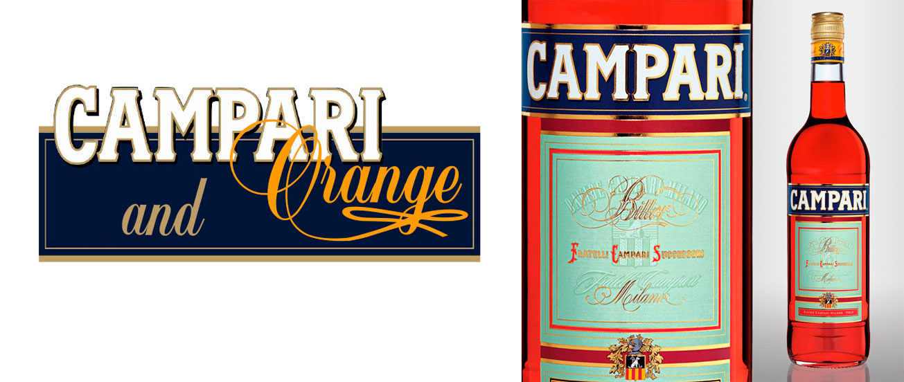
For the logo I decided to take all the current elements of the Campari logo but arrange them to a new look. First I moved the Campari- lettering out of the blue box to make room for the addition but also to show the exciting mix of the familiar Campari and the unique orange taste. To intensify this connection the Initial is overlaying the Campari logo. "Orange" is written in the font "Balmoral" to create an already known look and feel of the "Campari bitter" label.

Packaging/ Can
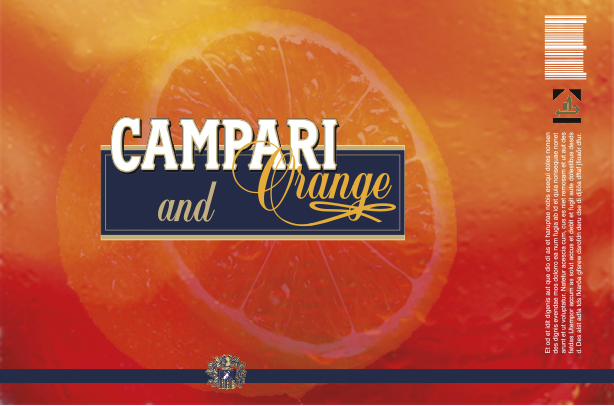
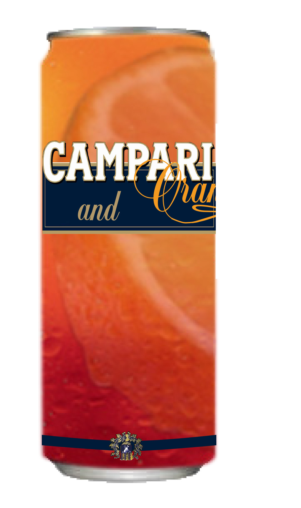
For the background of the can I created a color gradient from orange to red so it seems like the can is see-through with half of a orange floating around in it. I've changed the color of the ribbon to blue, to create a new look for a new product but with known elements. The logo I created is bigger than the visible range of the can so the customer has to take it out of the shelf to read the whole logo. Only the Campari logo is completely visible.
 |
 |
- student project -
