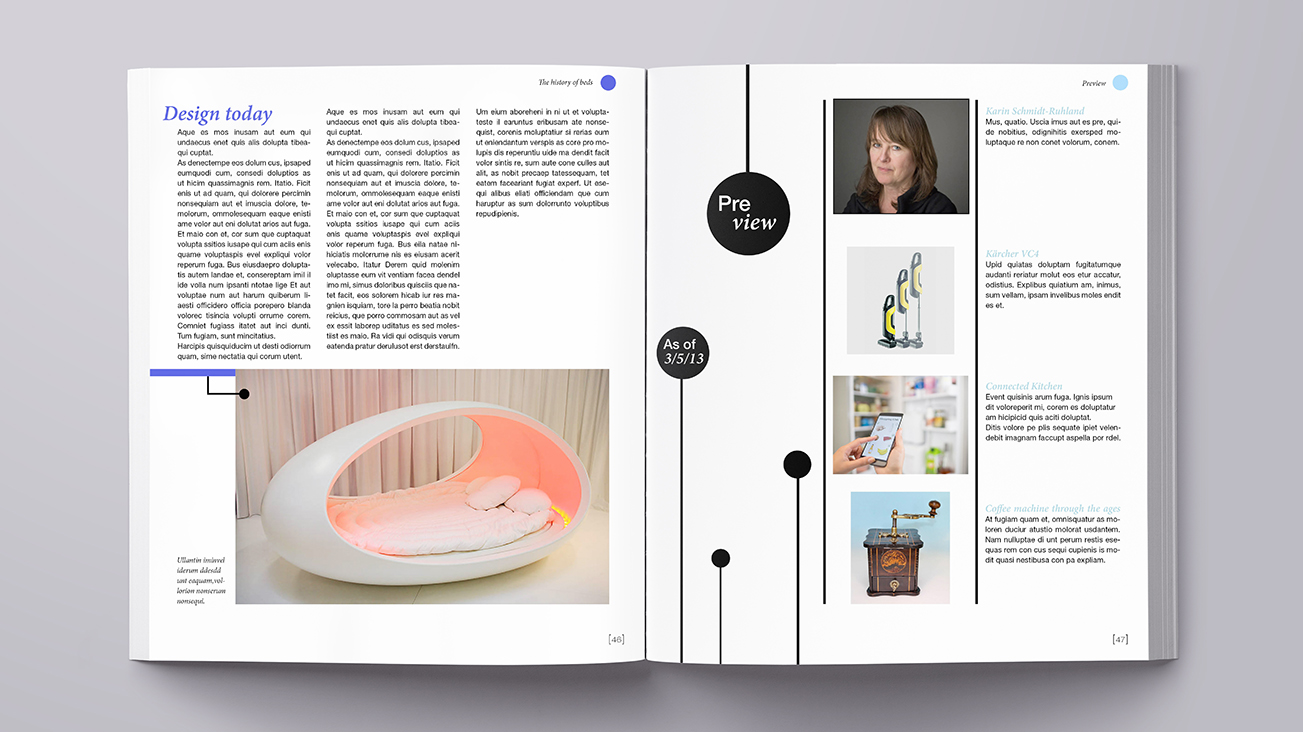
The challenge
There are hundreds of magazine on the market and most of them are losing buyers. But a couple students and I got the task to create our own magazine from scratch with a chosen topic about design. So how do you design a magazine that wins buyers instead of loosing them?
In a nutshell
After some research we decided to create a magazine about German product designers since there isn't any magazine focused on product design currently on the market. The magazine gets published 3 times a year with elements like designer, design process, design show and trends.
Name
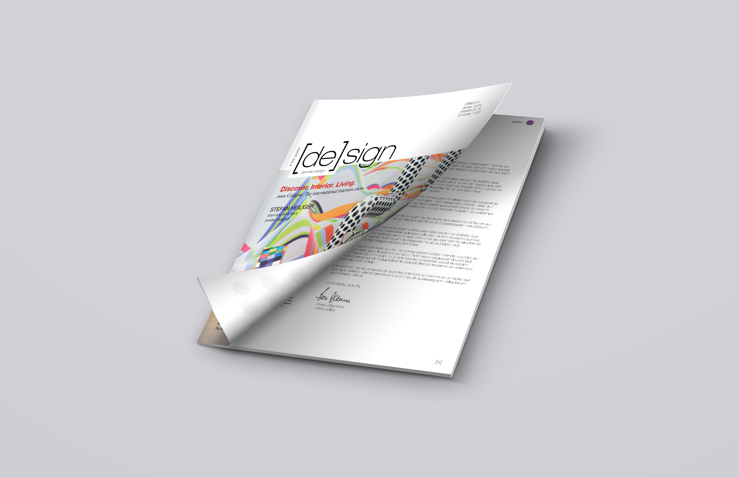
We decided on the name "design"
which is simple and also has the first two letters of deutsch (eng: german) already in it. Also we wanted to set a sign with this magazine and show how innovating and creative German design can be.
Logo
The logo we created is simple and recognizable. The bracket increases the logo impression and also highlights our USP, the "de" for german design. As font we chose Helvetica.
Design layout
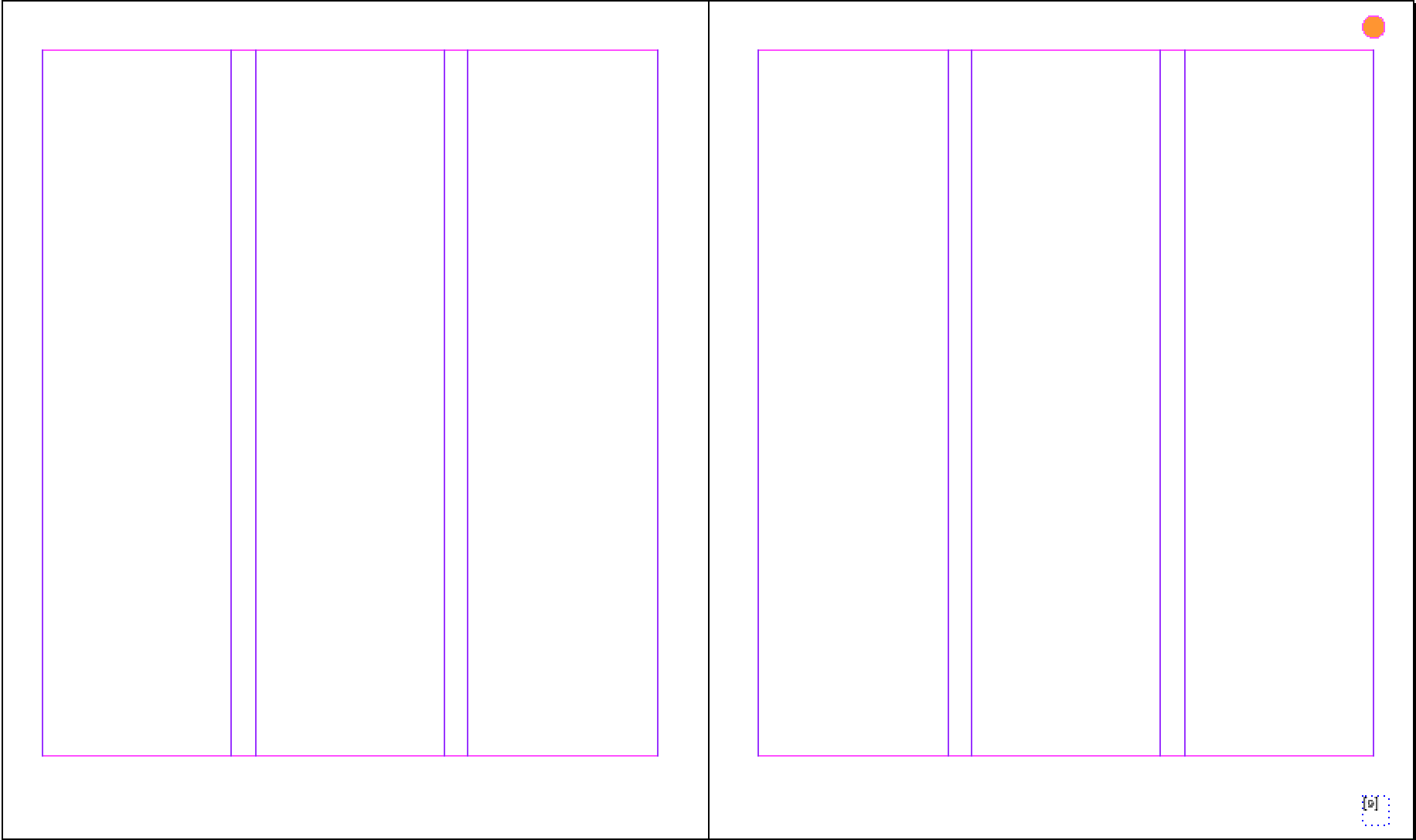 |
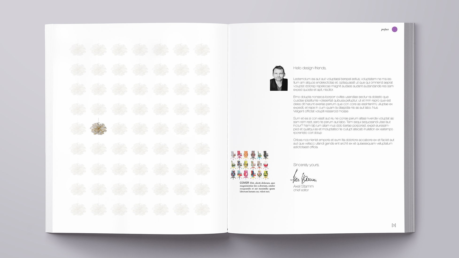
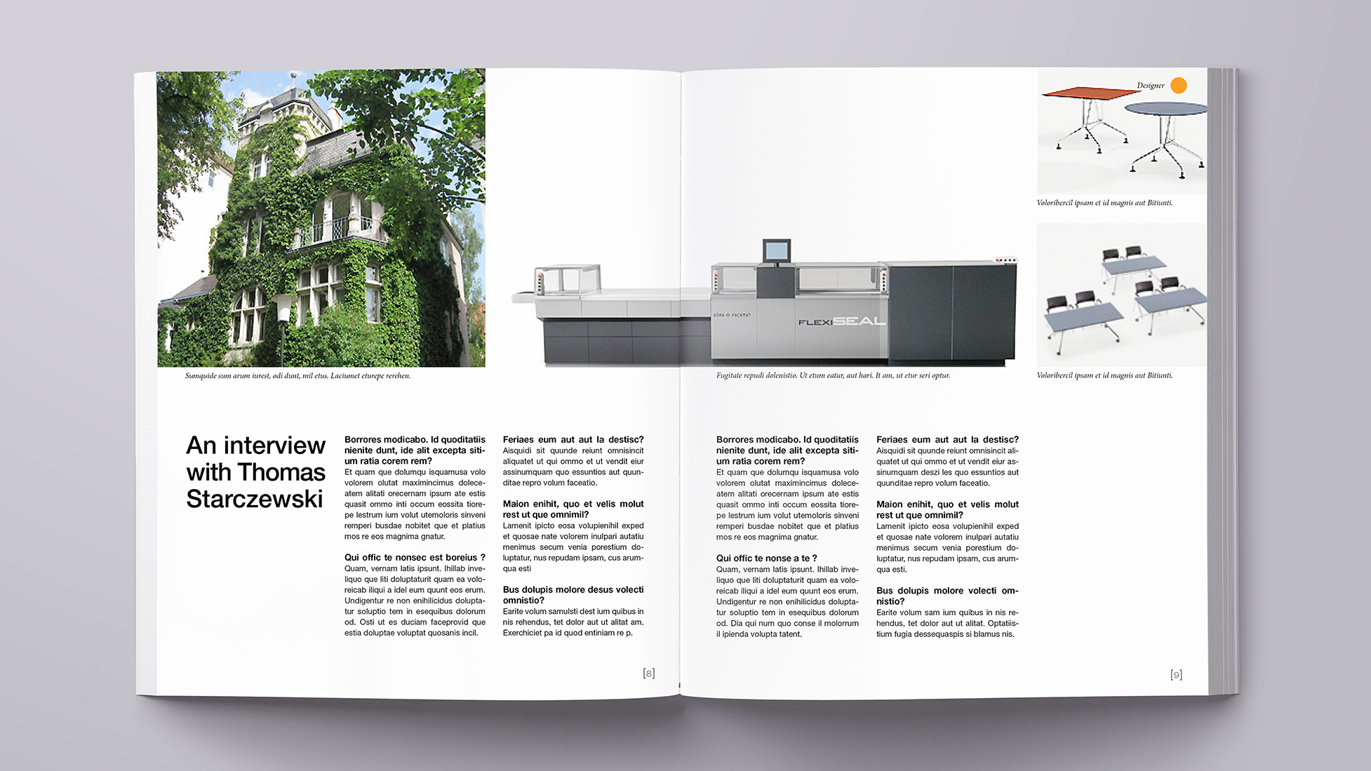
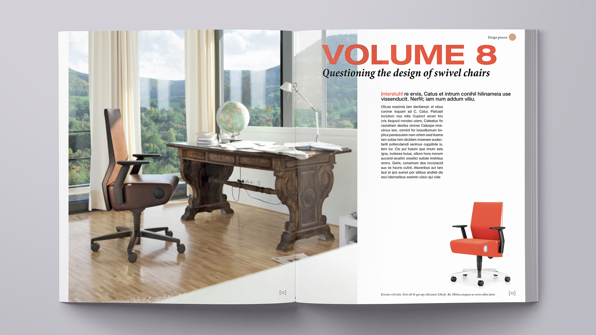
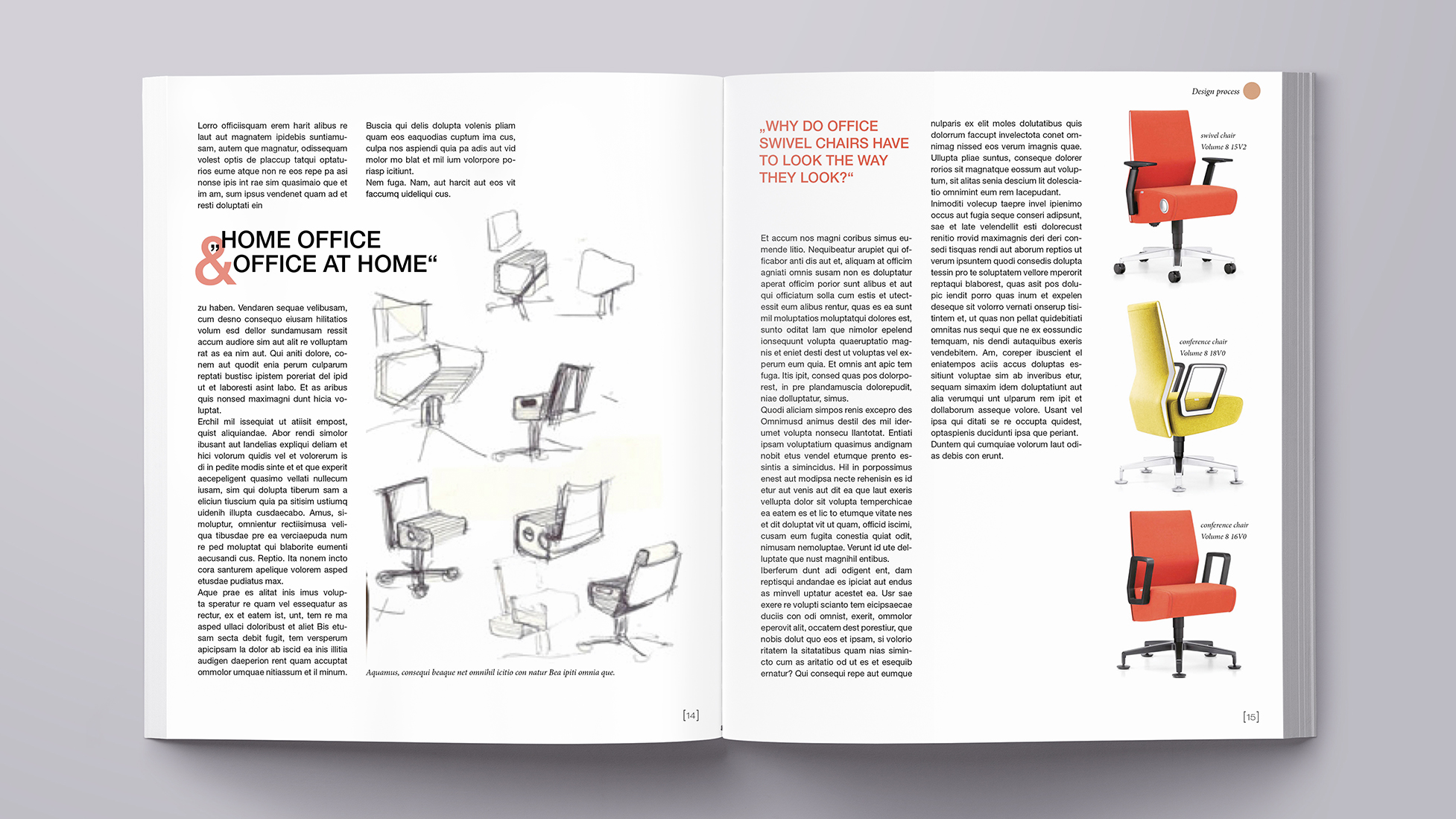
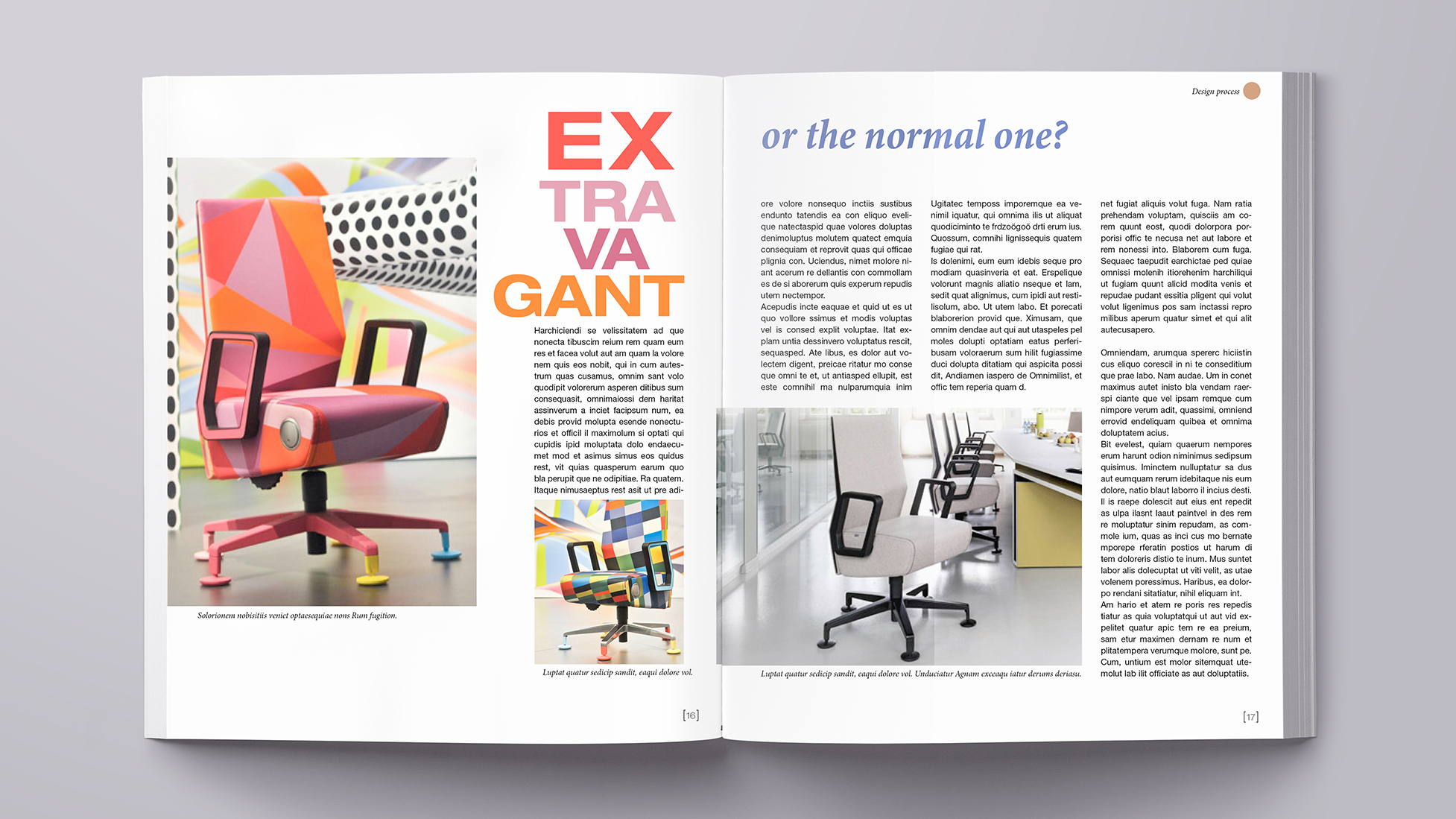
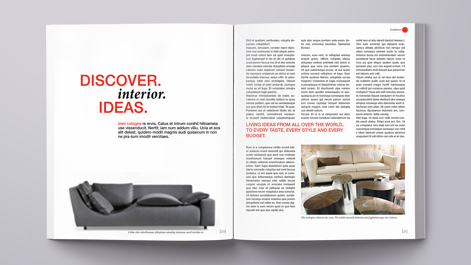
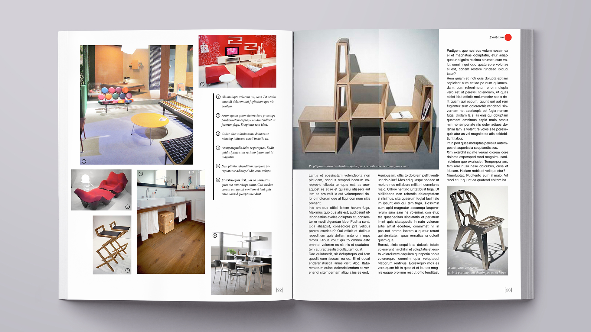
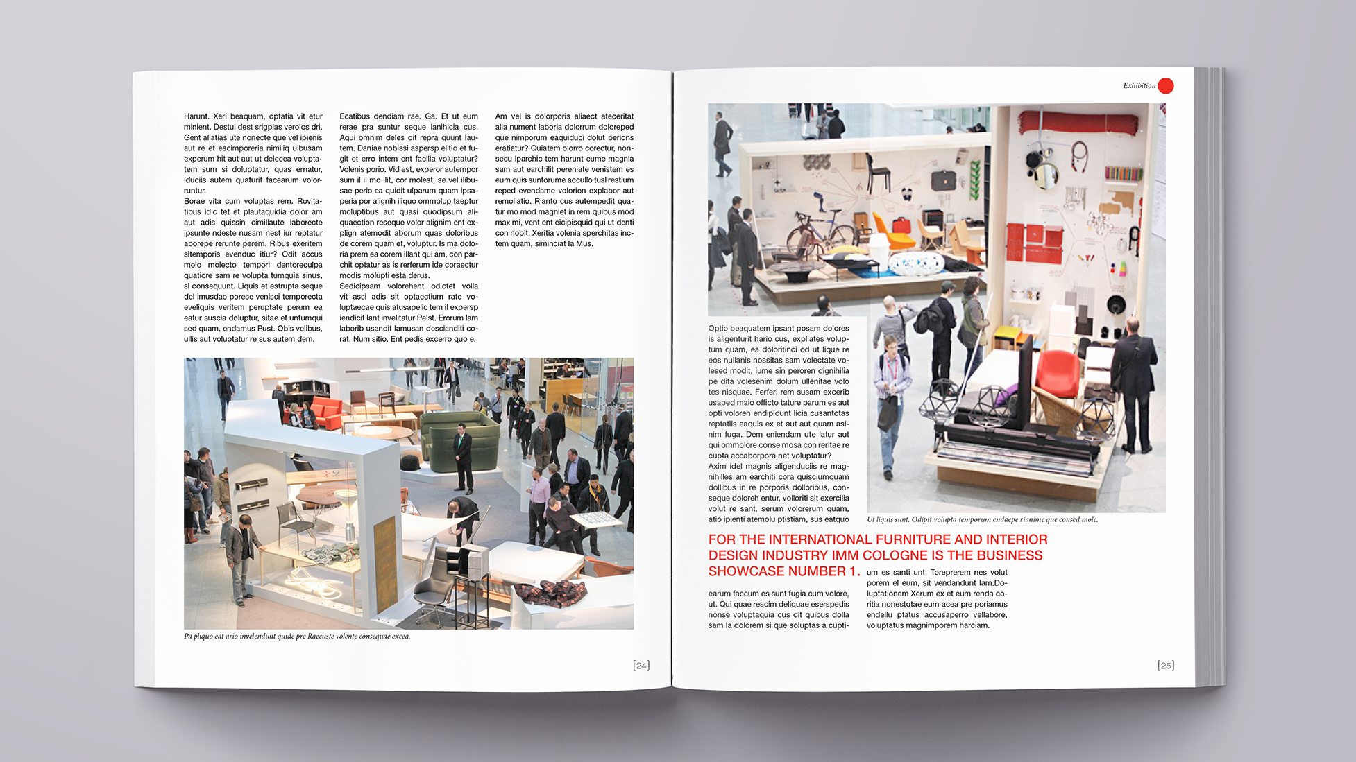
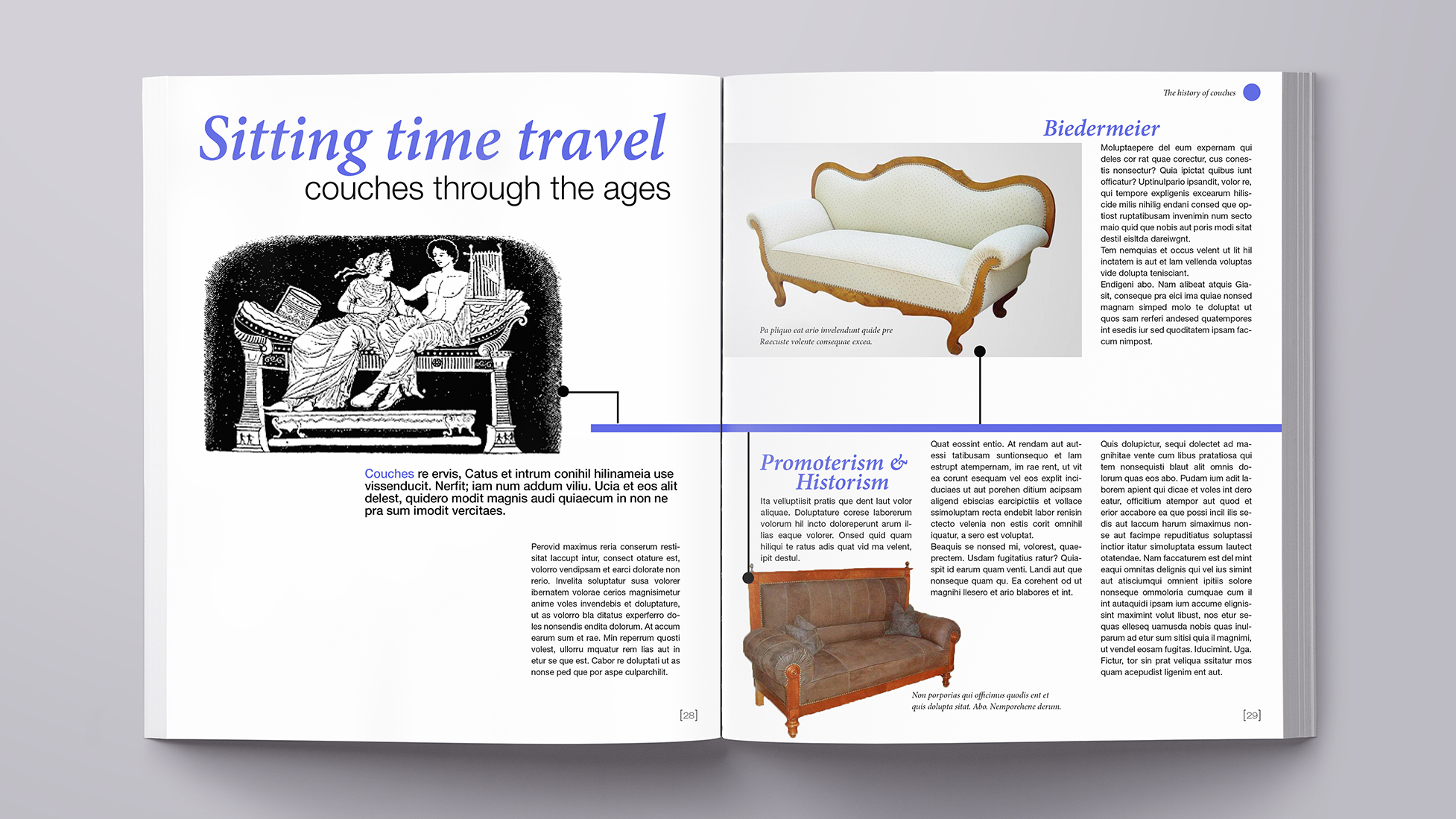
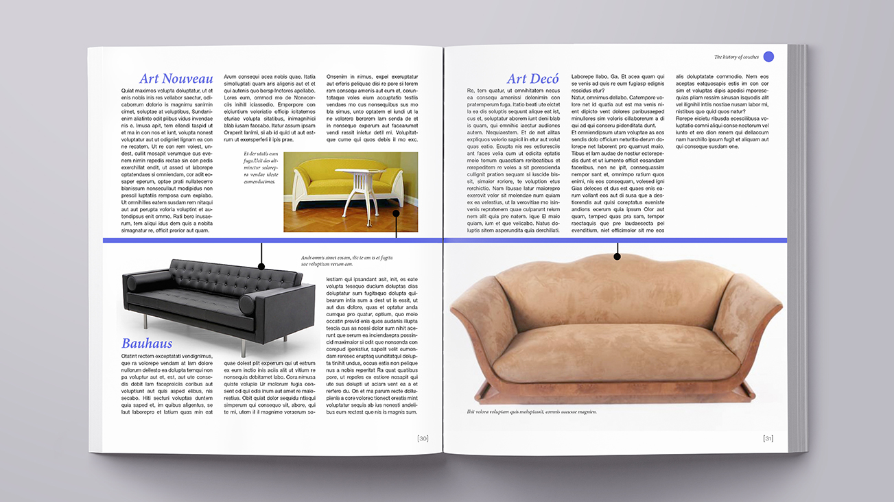
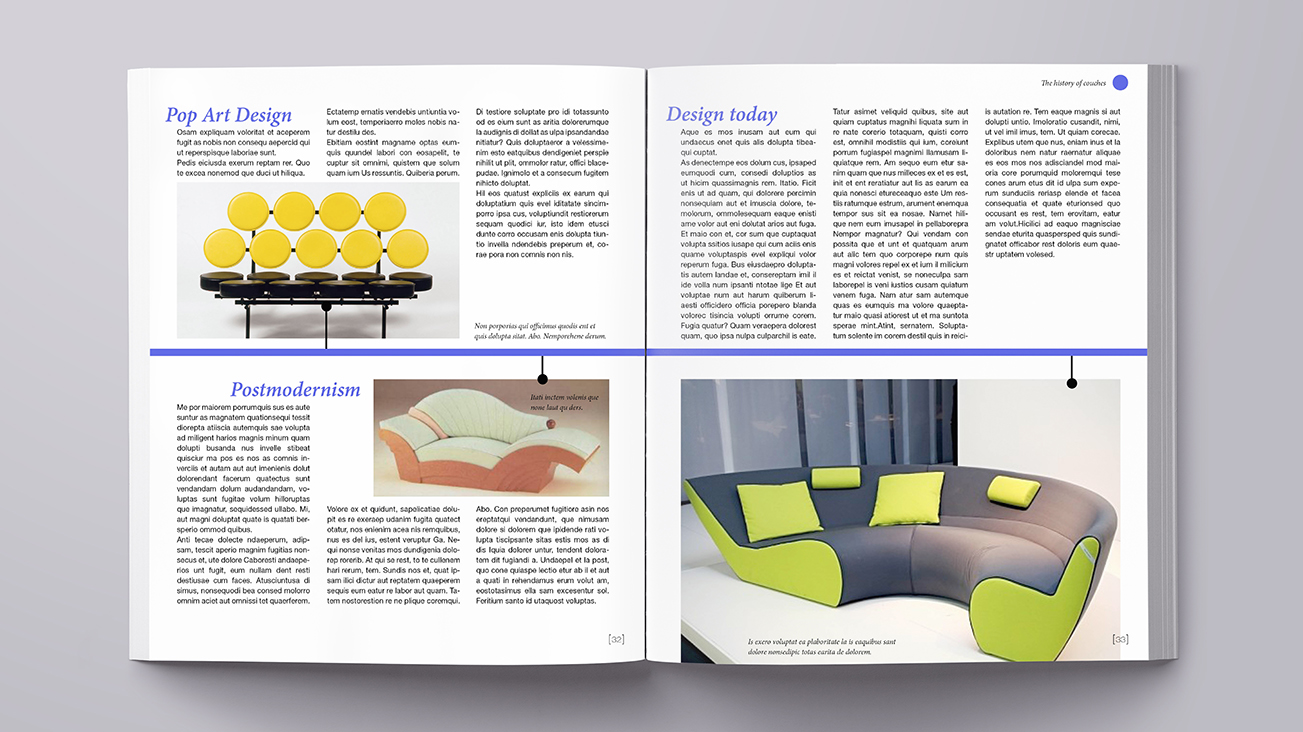
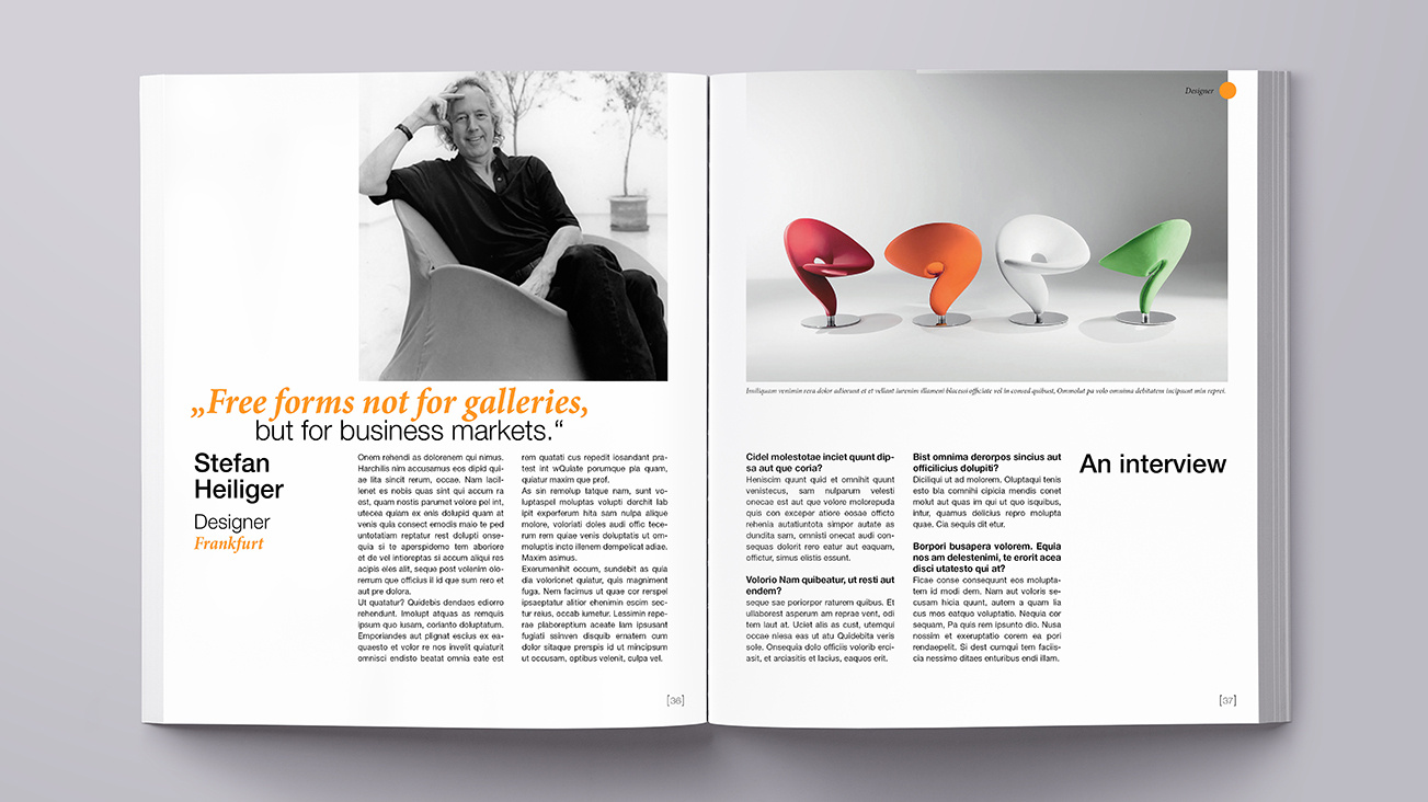
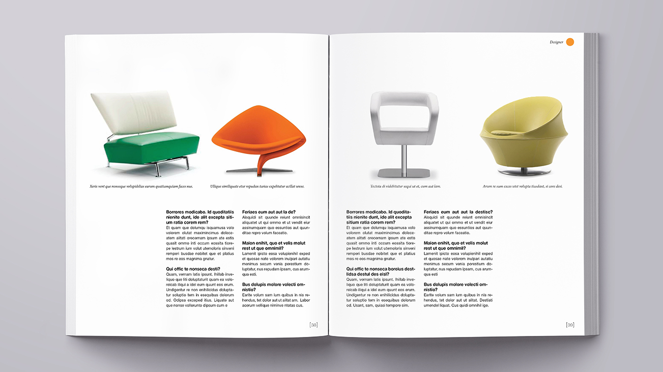
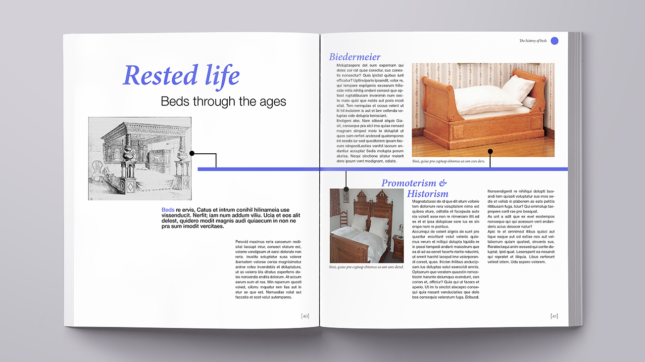
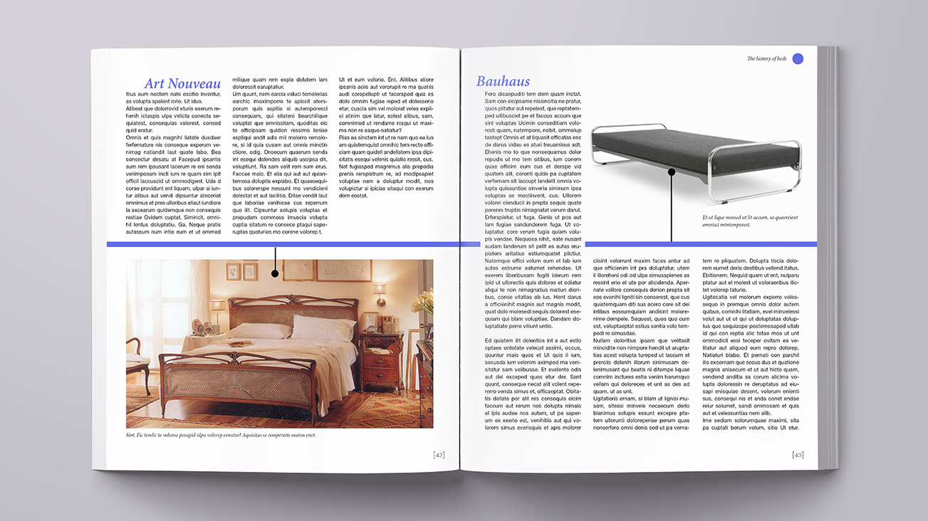
We decided to go with a 3-column design since it offers a lot of variation to place text and pictures. |
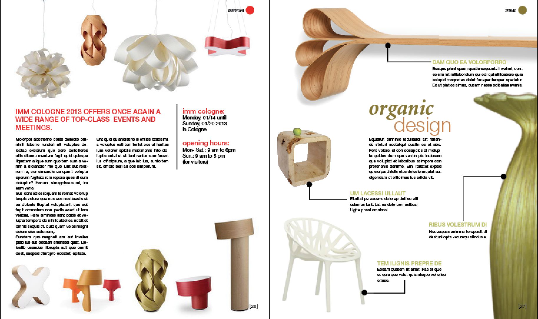 |
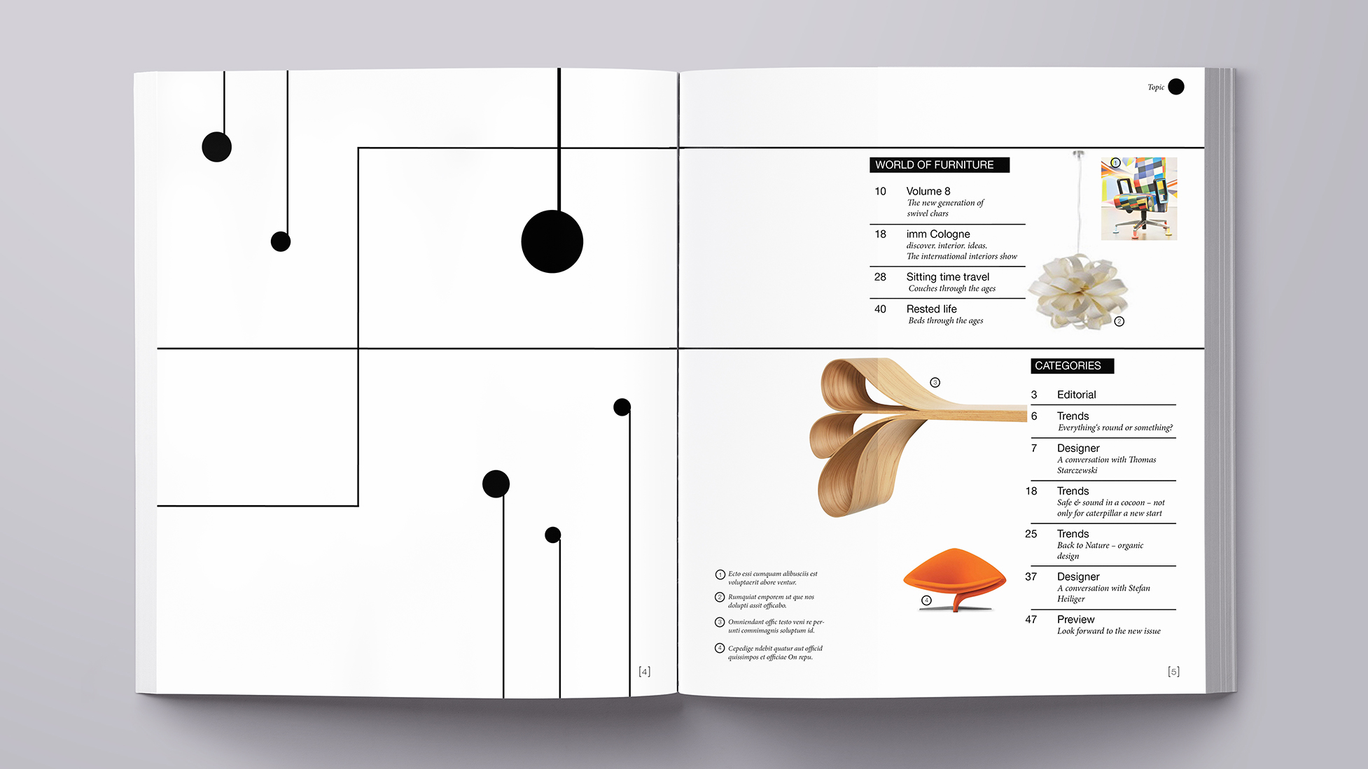
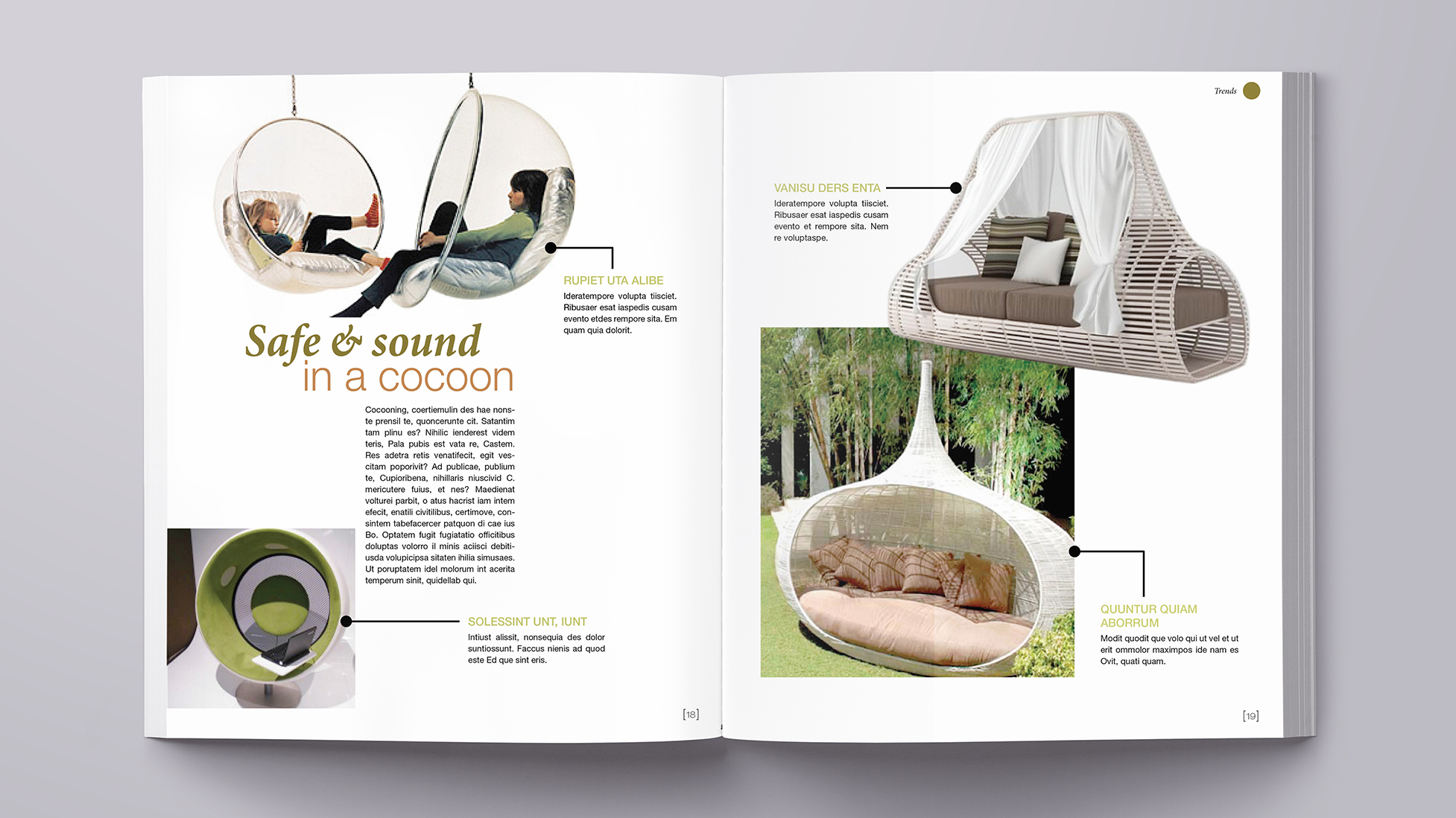
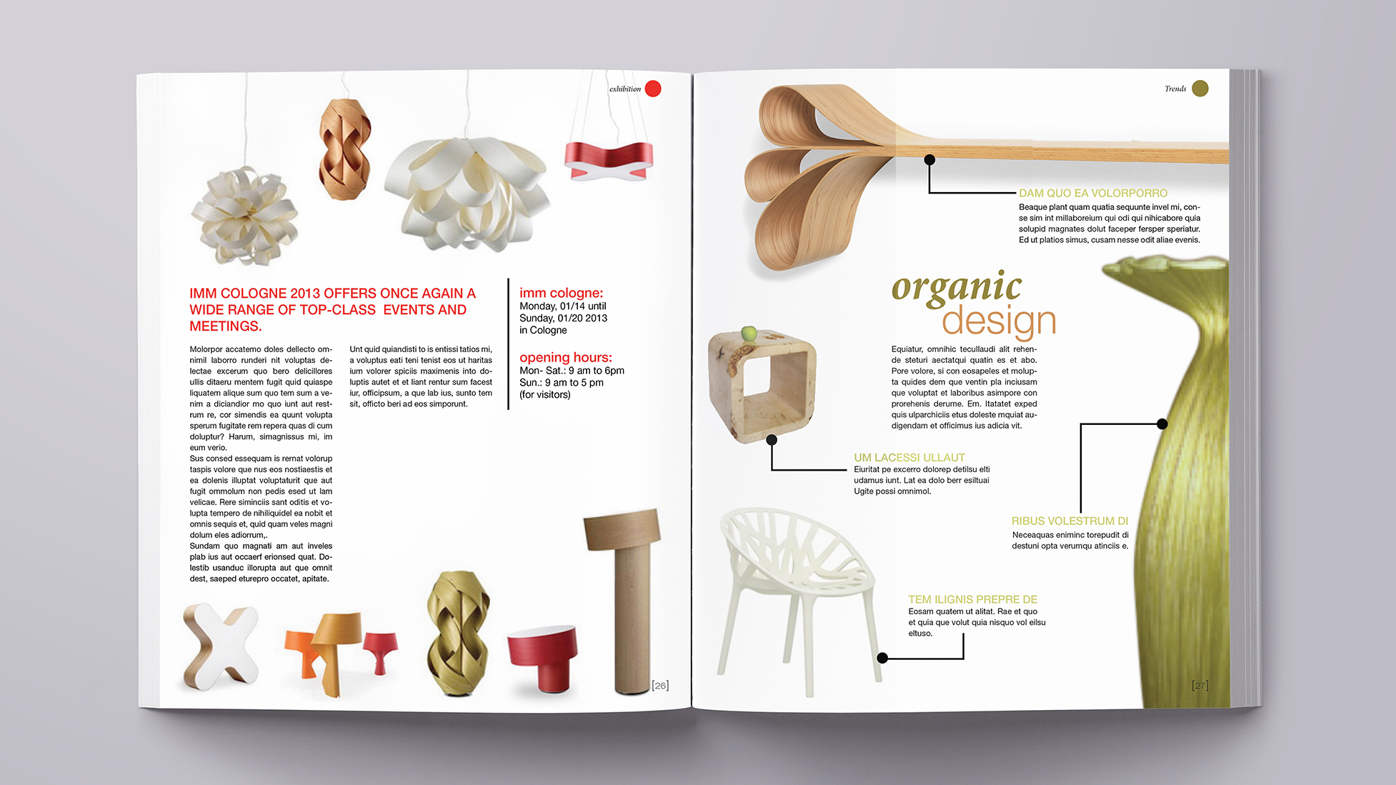
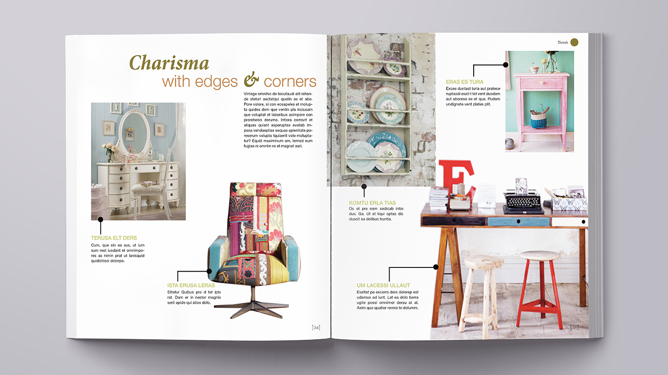
The only pages which break out of the printing area are the "trend" pages, which appear between every big topic as you will see further down if you click through the slideshow. The trend-pages also show design elements which are part of the CD of the magazine. The connecting elements between picture and text act as guidance in the more chaotic pages. Also we created another guiding element as seen on the top right of every topic. The circles have a different color for each topic with a keyword next to it. |
Cover

Magazine inside

